2025 Scholarship
The premise of this Scholarship Printmaking portfolio investigates concepts of belonging and identity through the central inquiry, “Where is my home?”. The Portfolio and workbook examine places of personal and formative experiences shaped by time spent in contrasting environments. The candidate grows up with a Dutch mother and Kiwi father in the central city in Amsterdam and later moves, at the age of ten, to a remote rural town in Canterbury. This geographical and cultural shift forms the conceptual foundation of the portfolio, informing subject matter and process-based decision-making.
The workbook provides insight into the emotional and cultural complexities of this transition, including sadness around leaving friends and whānau, the challenge of learning a new language, and the adjustment to a slower pace of life in Aotearoa. These experiences are examined through visual experimentation and written reflection. The artworks respond to specific sites and memories, considering how place contributes to identity formation. This inquiry is strengthened through reflections on ambiguity around belonging, including the annotation, “When I’m over there, New Zealand feels like home, and when I’m here, Europe seems like home.” This tension becomes a recurring conceptual thread across the portfolio.
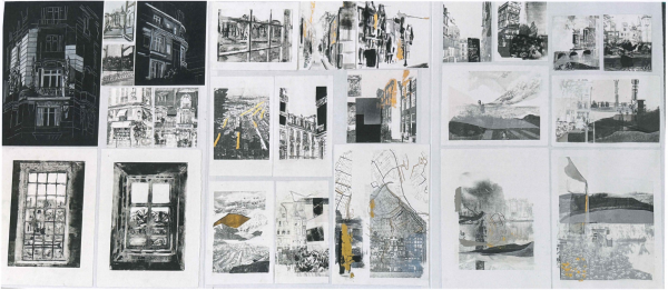
Initial works on Panel 1 employ high-contrast observational drawing to record places of significance. The candidate uses controlled mark-making to depict architectural forms and landscapes from past and present homes. A range of drawing and printmaking processes, including white pencil on black paper, monoprint, photo transfer, and collagraph, is used with technical fluency and purposeful selection. The inclusion of a large A1 mixed-media work, documented photographically, shows an intention to expand beyond conventional Portfolio formats.
As the portfolio progresses, perspective and viewpoint are increasingly manipulated to extend the inquiry through layering. Prints incorporate maps, architectural motifs and the canals of Amsterdam, combined with aerial views of hills, paddocks and peony fields from Sheffield. The peony flower operates as a metaphor for personal development and resilience, signalling the candidate’s growth as they navigate feelings connected to dislocation and disconnection. Through Panel 2, previously distinct worlds begin to merge and weave together.
The workbook demonstrates sustained inquiry and critical engagement with process. It contains the candidate’s own photography, layered photograms, drawings on New Zealand and Netherlands passport pages, collages, colour studies and extensive print trials using solar plates, monoprints, collagraphs, pronto prints, transfers and drypoint. Processes are not approached superficially but are revisited, combined and refined. This iterative approach shows an understanding of how making informs thinking, with each experiment contributing to decisions evident in subsequent works. The practice is driven by inquiry, analysis and reflection, resulting in a substantial and cohesive body of work.
Artist references are integrated meaningfully across both sites of evidence, informing conceptual approaches and supporting shifts into new pictorial directions. The use of gold leaf, inspired by the monogram on the Netherlands passport, is particularly effective. The candidate uses colour symbolically to add light and signify connections to place, aligning conceptually with the philosophy underpinning kintsugi repair, where gold is used to highlight breaks. These connections reinforce the overarching inquiry into identity and belonging.
On Panel 3, the works shift into more abstract and integrated compositions constructed through layered processes. Elements from both countries interweave: organic forms of foothills and mountains merge with canal bridges, architectural structures and pedestrian or cycle crossings. Peonies cross over maps, while aerial views of farmland layer over and under former homes in Amsterdam and France. Subtle tonal shifts construct dreamlike spaces where forms dissolve and re-emerge, suggesting the fluid nature of memory and identity. Material and technical decisions, including printed cardboard forms, collagraphs, flooded and bleeding transfers, stencils and translucent layers of tracing paper, are purposeful and conceptually aligned, supporting meaning across the Panel. These works bring together the contrasting urban and rural environments in a cohesive manner.
Progression of ideas, lines of thinking, decision-making and pictorial shifts is evident across the portfolio, demonstrating sustained inquiry, refinement and critical development. The final pages of the workbook show further extension, including a three-dimensional work, a layered photogram and proposals for installation-based outcomes that expand the investigation into notions of layering, transparency and opacity. These directions support further exploration of the concept in depth and range.
Overall, a key strength of this portfolio lies in the thorough investigation of processes and the fluent synthesis of varied media. The Portfolio and workbook together present a cohesive and resolved body of work that demonstrates a sophisticated understanding of printmaking practice and a personal, critically engaged inquiry into identity, place and belonging.
On this page
2024 Scholarship
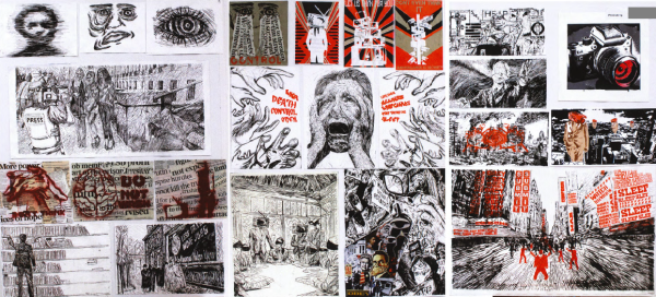
This Scholarship Printmaking submission establishes a proposition relating to media corruption and societal control. The enquiry inventively investigates in depth ideas and builds conceptually and pictorially through examining the idea that the media is manipulative and “shapes how we see the world, often distorting or controlling narratives.”
Ideas relating to isolation, grief, and desolation are informed by examining artists, including Käthe Kollwitz, Shepard Fairey, Banksy, and Edward Hopper to guide both pictorial and conceptual concerns. The workbook includes data and statistics and documents the thinking and the artistic exemplars behind each work.
At times there are also descriptions on how each work was made. Processes include collage, stencil, screenprint, drypoint, and woodcut. The final page of the workbook presents a three-dimensional assemblage offering possibilities for extension.
The workbook discusses ideas about fake news, misinformation, half-truths, propaganda, manipulation of the truth, brainwashing, selective storytelling, media saturation, the impact of social media and algorithms on young people, the blurry lines between facts and opinions, and biased reporting. There are references to the ideas of political theorist including Noam Chomsky and Edward Bernays. Soviet and Maoist propaganda posters and literature including George Orwell’s 1984 are also noted as inspiration.
The first panel sets up the idea of distortion and the media being drawn to sensation and glamour, rather than societal issues. The submission starts simply and builds momentum and complexity. In the smaller series, a hand symbolically controls puppet strings, and a figure is chained to a television. Collaged statements from newspapers help reinforce the proposition.
Panel 2 starts with works referencing political posters and goes on to present an image that clearly communicates the researched ideas by replacing faces with television screens or blindfolds. Text is used to build and extend ideas.
The focus on Panel 3 shifts to surveillance and the idea of ‘Big Brother’ watching over society. This final panel is provocative and creates a sense of being bombarded with billboard messages. Barbara Kruger’s work comes to mind with the messages to consume, work, buy, and obey.
This powerful and dynamic submission has clearly laid out workbook pages and a portfolio of successful compositions and works that confidently uses a limited palette of black, white, and red to define the subject matter through a combination of graphic and expressive media. The mix of screenprint and drypoint processes enable the candidate to create bold forms and shapes alongside detailed facial expressions.
To sit higher up the rank order in Scholarship Printmaking, the pages spent documenting and talking about works on each of the three panels would be better used investigating and testing further possibilities through artmaking. Space is valuable in the workbook so including photos of images seen on the portfolio is unnecessary.
The work successfully engages the viewer in reflecting on and questioning the nature of information we consume. We are reminded to be aware of the control media can hold over society, encouraging the viewer “to question the reliability of the information presented to them.”
2023 Scholarship
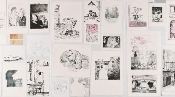
This Scholarship Printmaking submission is a personal project about Trans/Queer identity and the feelings and raw emotions that arise through repression of identity. The workbook is raw in its delivery of the thoughts and ideas that the candidate wrestles with daily, both in living life and when drawing and making prints. It is significant that they have chosen to bring the viewer into their world to both share and educate through their own lived experience of queer suppression.
Compositional spaces within the prints communicate the poignancy of the candidate’s experience and speak to loss, isolation, repression and intimacy. The candidate exercises an ethic of care in the way they make marks and compose each work on the folio. Evidence of the plate edge on prints is impactful and locates the image in space and the subject (themselves) in time within a scenario. The poses utilised throughout the work are authentically composed; looking at the work, we see into the figure’s world and understand and feel the nuance and tensions being communicated.
Visual devices are employed that conceptually nod towards the complexity of emotions and purposefully disguise their identity and presence through tactics like shielding and burying oneself. This ‘hiding in plain sight’ is established through figure poses and gestures, the absent figure and silhouette, subtle visual references to the ways they feel the pain of masking their identity through the imagery of everyday activities (e.g. drinking depicted through cans, bottles, a single glass and bottle, and red wine stain on the floor). There is a strong sensitivity to tone and form, light and contrast, including restrained use of colour, which is well-managed through printmaking conventions and technical care. Tonal shifts in ink and line equal a change in emotional state or mood. Likewise, when the image becomes jumbled with multiple line drawings layered onto one another, we visibly understand the tension and an audible shift of perception.
The workbook is predominantly notational, with many images of experiments and works in development and other exploratory processes/works that led to folio works (or were being made in parallel: painting and photography). Artist reference is relevant and provides ways for the candidate to think about mark-making in relation to emotion and how they can build a heightened sense of character, feeling and actions. The pace of the folio works beautifully, emphasising the tension of the felt emotions through its calm and spatially-considered format.
Download 2023's Scholarship Printmaking exemplar [PDF, 6 MB]