2025 Outstanding Scholarship
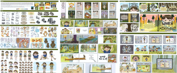
This Outstanding Scholarship portfolio demonstrates a sophisticated understanding of the central proposition, beginning with extensive research into how children experience emotions, trauma, and resilience. Research for the brief “When I fall in the mind forest” informs every phase of decision-making and underpins the clarity of purpose and audience. The candidates’ analysis of conceptual and visual language demonstrates perceptive insight as they consistently reflect on how young children engage with imagery, narrative voice, and learning tools, thereby shaping outcomes to meet these needs authentically.
Throughout the workbook, the candidate systematically evaluates and reforms ideas, returning repeatedly to refine typeface design, character development, and narrative structure. This iterative process sustains both core concepts of emotional expression and storytelling, as well as subsidiary ideas such as developing tools that support positive behaviour and resilience.
The candidate’s performance demonstrates independence through the creation of a selfmade image bank, hand-built typeface, and character iconography representing diverse emotional states. Lateral thinking is evident in their ability to shift between outputs, including storybook spreads, flashcards, and an app, while exploring imaginative possibilities and maintaining conceptual cohesion.
Research drawing on child development, illustrative practices, and visual communication informs a coherent and multilayered project. The candidate integrates knowledge from educational, emotional, and design contexts, resulting in outcomes that are both conceptually rich and visually engaging.
The candidate moves beyond a single outcome by developing the project into interconnected formats, including the illustrated book, flashcard system, and interactive app. Each extension is informed by research into how children learn and process emotions, demonstrating strategic and purposeful lateral expansion.
Illustrations, typeface, layouts, and app interface design show skilled and confident handling of media and production values. The candidate continually produces new illustrations in direct response to narrative developments, resulting in original and expressive visual language suited to young audiences.
Research into children’s emotional development, alongside investigation of relevant visual models, informs shifts in direction across the workbook. Each phase shows the candidate repositioning their inquiry, moving from storytelling approaches to game-like interaction and app design while sustaining the core concept.
The candidate demonstrates understanding of how design formats influence meaning, adjusting layout principles for different platforms. Their integration of text, image, and interactive elements shows thoughtful evaluation of how each process supports emotional education and audience engagement.
Work across the Portfolio is cohesive, confident, and stylistically unified. The candidate’s voice remains consistently clear, and the intent to help children understand and express emotions is evident in every outcome. Independence is reinforced through original illustration, self-directed research, and confident handling of a distinctive visual language.
Playful, illustrative iconography, a hand-built typeface, and atmospheric scenes together construct a compelling, child-friendly visual language. This language is applied fluently across formats and remains aligned with the project’s emotional and educational aims.
The candidate demonstrates strong refinement decisions as they move from investigation toward polished final spreads, cover design, and app screens. Their ability to filter and synthesise ideas ensures that final outcomes appear resolved and original.
Typography, composition, sequencing, and character design are investigated through a conceptual lens focused on how children perceive emotion and narrative. These considerations inform formal design decisions and strengthen conceptual clarity.
The workbook clearly articulates the candidate’s reasoning, documenting how each design choice supports the central purpose. Critical commentary demonstrates awareness of audience needs and a reflective approach to refining the emotional narrative.
Download 2025 Outstanding Scholarship Design workbook [PDF, 12 MB]
On this page
2025 Scholarship
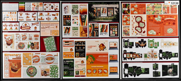
The Scholarship Design portfolio demonstrates logical development and intentional decision making from the outset in the cohesive narrative brief “Shroomery”, centred on home mushroom cultivation. Beginning with a thorough and original investigation, they generate their own illustrations and imagery rather than relying on found sources, establishing a clear visual foundation. Their logo investigation is comprehensive and shows purposeful testing, refinement, and selection that evidences an ability to evaluate and reform ideas through an iterative process. This approach reflects critical thinking and perceptive understanding of how visual strategies communicate with clarity and resolution.
The transition into zine development shows how the candidate selectively employs methods and formulates visual and conceptual devices to advance ideas. Their workflow is lateral and well structured, demonstrating fluency with materials, media, and publication conventions. Rather than repeating imagery, they expand their visual language and apply typography with control, consistency, and communicative intent.
Research informs each stage of the portfolio, supporting contextual understanding and engagement with the subject matter. This integration extends into poster design, website development, and packaging, where the candidate adapts methods to suit different formats while maintaining conceptual cohesion. Interaction planning and scrolling behaviour in the website design demonstrate technical understanding and the ability to deconstruct and integrate media processes to realise complex outcomes.
Throughout the portfolio, communication strategies remain clear and audience focused. The candidate defines their target audience early and uses this understanding to guide tone, messaging, and visual language across all deliverables. Taglines, typographic hierarchy, and cohesive branding reinforce clarity, while contextual mock-ups establish outcomes within real-world environments.
Final works, including the zine, posters, website, and packaging, are fully resolved and crafted to a high standard, evidencing strong production values and conceptual resolution. The workbook is used effectively to clarify communication strategies, evaluate production steps, and identify subsequent stages, highlighting links between intent, process, and outcome. This sustained development and systematic refinement reflect independence and a critical perspective that elevates the overall portfolio to a Scholarship level of performance.
The volume of self-generated imagery, research-informed analysis, and typographic exploration is a notable strength of this portfolio and reflects deep engagement and a strong commitment to the subject matter.
2024 Outstanding Scholarship
Social Scape is an exemplary example of an Outstanding Scholarship Design brief and
communicates a clear provocation of a real-life issue addressing the subject of
misinformation informed by the candidate’s personal experience and perspective. A duality
of personal knowledge and data-driven research informs a visual investigation that
contextualises ideas and utilises tactics such as humour and persona to develop characters
that connect to the audience. All design outcomes fluidly integrate and inform the next phase
of working, which culminates in a final format pertinent to addressing the consequences and
complexities of this topic in a social context.
The workbook substantiates ideas, articulating relevance and importance of educating and
informing young people around the dangers of the use of AI and online platforms within
digital media. In parallel, consideration for the target audience demonstrates an ability to
think laterally with strategies and the decision to produce a board game, places analogue
processes at the heart of the design solution. The candidate has combined context and
media that challenges the conventions of digital online media and employs a user-centred
framework to educate the audience. In the workbook, characters are personalised and given
anthropomorphic features that are used to communicate key messages within the campaign.
Expressions and personality are highly considered and tested with the target audience to
understand user functionality and experience. The colour palette is thoughtfully considered
and underpinned by knowledge of colour theory to reflect personality traits relevant to
message and for young people to understand.
This investigative mode of enquiry is sustained holistically across the folio and annotations in
the workbook and reveals high levels of research, critical thinking, and analysis of the topic.
The communication has been used effectively through new strap lines, catchphrases, names,
and information that can be read with clarity. The final game play interaction brings together
a range of devices that sits within the conventions of gameboard design to create a
sophisticated and engaging outcome.
Download 2024 Outstanding Scholarship Design workbook [PDF, 3.2 MB]
2024 Scholarship
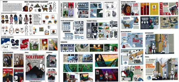
The Scholarship submission Cataclysm Films establishes a design brief aimed to promote an
animated film set in an apocalyptic world. There is clarity of thinking in the brief to ensure
that constraints and parameters foster a linear process that is underpinned by critical
evaluation and decision-making. This is a solid example of Scholarship rewarded for its
foundational focus on research and ability to resource and invent ideas that communicate a
coherent and appealing narrative and theme. The workbook outlines clear and logical
development and annotates to evaluate the development and regeneration of ideas. The
editing and inclusion of research into the target audience, statistics, symbolism, and key
messages in the workbook delves into the topic and affords a breadth of resources to draw
upon that sustain the enquiry. The workbook is used to drive the investigation, which
translates to the working designs on the folio with clear intentions, explicit communication,
and synthesis of a personal design style. The design process employs design strategies to
advance ideas communicated through a range of collateral – poster design, ticket, website,
and double-page spreads. It is evident that the design process is critically managed through
the buoyant range of ideas, the decisions in creating characters, and the integration of ideas
fuelled by phases of research.
Ideas are consolidated by a command of graphic design and storytelling conventions. The
candidate confidently employs media and technical skills to execute options and construct
links between phases of work. There is a sophisticated understanding of the relationship
between typography and image, with an ability to construct and transition towards new
solutions. The candidate has analysed the functionality of design frameworks that operate
within and between formats, capitalising on tropes to independently position their own
graphic treatment and style. Illustration and image-making pay homage to the conventions
employed in graphic novels and animation, enhancing communication, and are coupled with
typographic messaging, headings, subheadings, and body copy to also enhance audience
experience.
Storytelling is central to the brief and this submission understood the context and methods
required to communicate and craft a final resolution within each phase of work, ensuring high
productional values of design.
2023 Outstanding Scholarship
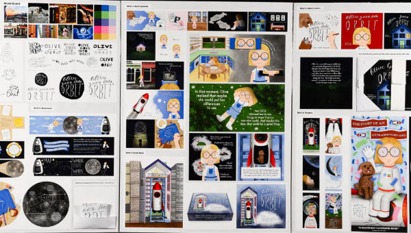
This Outstanding Scholarship Design illustration-based submission required the candidate to “design the graphic identity and promotional material” for the children’s storybook Olive Goes Into Orbit. Drawing on their personal experience of being neurodivergent and having a passion for aerospace engineering, the candidate developed an original storyline to unpack a parallel story through Olive, who also has OCD and lives in a world filled with worries, fears, and everyday struggles. Like the candidate, Olive has a companion in Cooper, the dog, to help her through. The briefs include event ID, book launch brochure, double-page spreads, a book nook (accompanying 3D model), a book cover, and posters for the book release.
An overarching modality of visual metaphors is employed throughout and cleverly utilised to communicate information, emotion, and ways of seeing. The candidate researched conventions thoroughly, providing a solid basis for intelligent experimentation and decision-making. They considered how they can draw readers into the story so they feel comfortable and reassured about the content. Editing decisions were made by understanding designs in situ and being open to change. Sketching out ideas played an integral part in the typography ideation and, similarly, in the generation of imagery. Photographs taken of hand actions and their dog were then transferred into character designs, maintaining a sense of authenticity. Stock imagery is converted into simplified line drawings that became compositional backgrounds for the storyline.
The story arc utilised conventions that relate situationally to the candidate’s personal journey. The workbook includes an analysis of Olive’s everyday life, along with storyboarding, that leads the reader through the trials and tribulations of the character’s journey to the moon. The delight of discovering the visual metaphors in all the briefs makes this submission conceptually and critically inventive. The details beautifully communicate emotion and a determined attitude: Olive’s half-filled glasses when she gets overwhelmed, her startled eyes, and her quivering mouth. This is matched by the dual narration of personal information about Olive: her dislike of olives, skipping cracks in pavements, and lying dreaming amongst the daisy typeface. Likewise, building empathy with the reader is achieved compositionally through scale changes to suggest vulnerability, bird’s-eye view, proximity, and isolation within the picture frame.
A strength of this submission is the candidate’s research into the design conventions of the media and formats utilised. The interactive aspects of the fold-out circular brochure and the bespoke book nook bring this proposition to life. You can imagine Olive Goes Into Orbit in a children’s bookshop along with all of the merchandise developed by the candidate for this submission, including future ideas.
Download 2023's Outstanding Scholarship Design exemplar [PDF, 6.2 MB]
2023 Scholarship
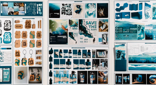
This Scholarship Design submission settled on creating an advertising campaign for the brand Oceano, exploring the effects of sunscreens on the environment and the impacts of chemical spills into oceans. The workbook documents the journey towards finding a topic of personal interest that focuses on environmental concerns, preservation, and care surrounding coral reefs and marine life.
In critically considering a range of possibilities that sat in real-world contexts, the candidate was able to identify a flexible and generative set of briefs. The campaign includes a logo, floating keychain, poster, recyclable plastic sunscreen bottle, 3D information booklet, and an interactive exhibition space – all of which are contextually well-handled. For example, the 3D information booklet (included as a concertina fold-out on the folio) has a tactile quality, achieved through topographic map-like layers and cut-outs, raised relief captions, and interactive flaps (information windows).
There is a strong sense of the candidate’s hand in the making, which inserts a sense of personal conviction along with the informative text (copy writing) and visualisation. Materials were chosen to make products conceptually relate to the brand – the floating keyring is made from cork and buoyant material. This environmentally friendly attitude is present throughout the entire enquiry with the generation and use of motifs, typography, colour, and scale contributing to the fun and interactive elements and overarching tone the candidate wanted to impart. Issue-appropriate questions were asked when developing the collateral for the various self-designed briefs by utilising well-researched data and existing companies and brands on the market.
Solutions to problems posed are dealt with through strong material exploration and hands-on making. The workbook shares the successes and failures of the candidate’s working with plastics and resources aligned to the topic and the point where innovation and potential design solutions came to the fore. The workbook analyses ‘how’ ideas could be put into action through problem-solving feasibility and the practicalities of repurposing materials into forms, such as making the sunscreen bottle through heat processes. An experimental approach is employed throughout the folio work, with the candidate taking their own photographs to recognise visual qualities that link media to the ocean, such as the aesthetic of the melted plastic.
The candidate engaged with briefs that operate at different scales and require design-appropriate ambitions. They met these through constant attention towards the potential reception of each outcome and having a sharp focus on the knowledge and experience they wanted to communicate to a learning public, including the purpose and functionality of the various design propositions.